57.nyc
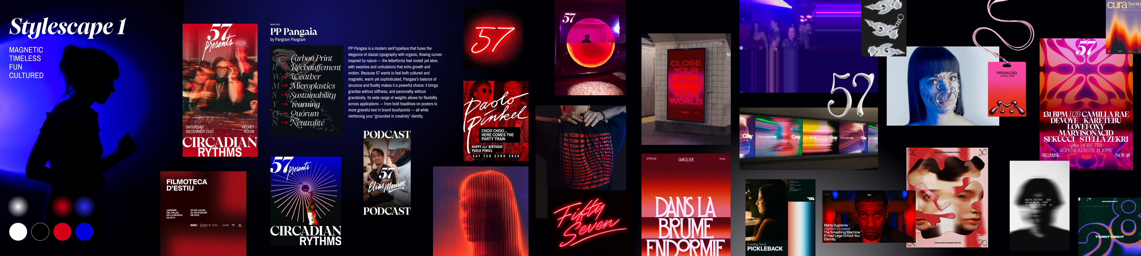
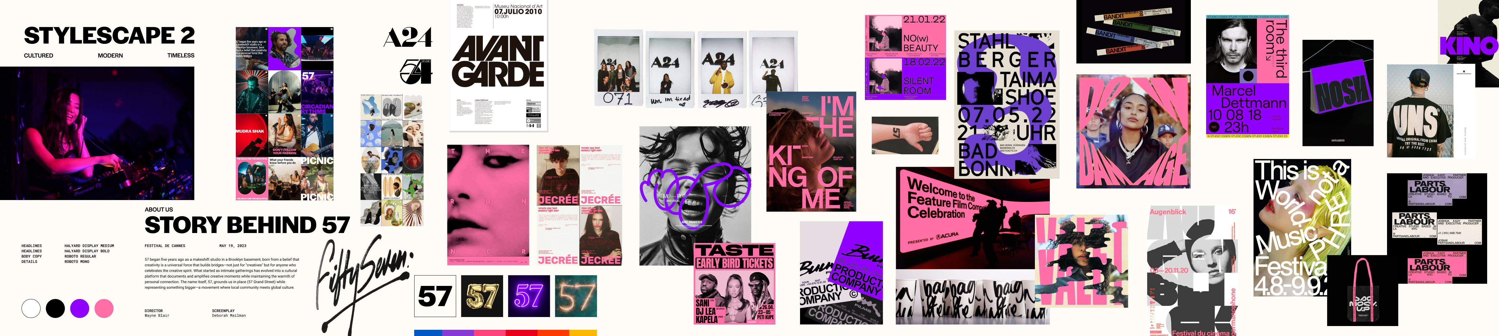
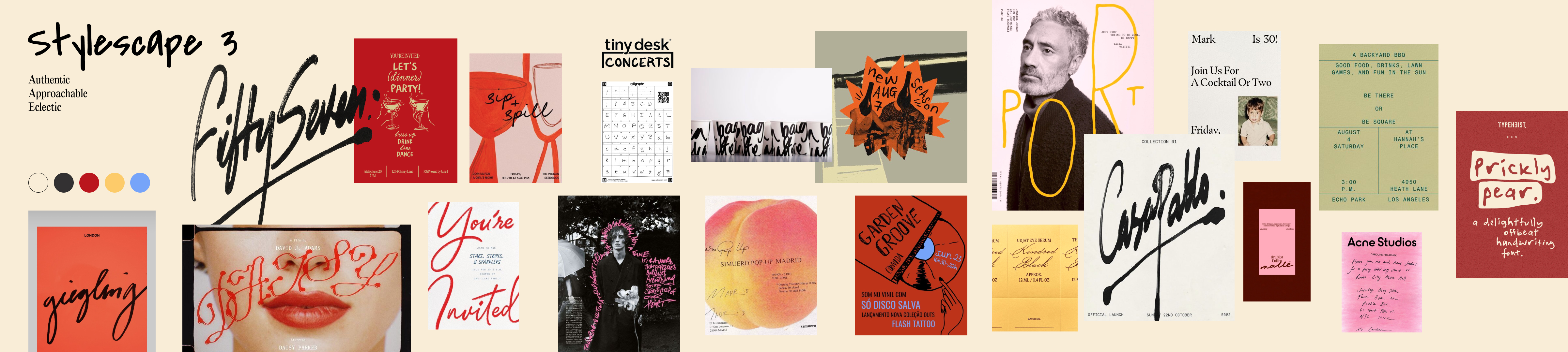
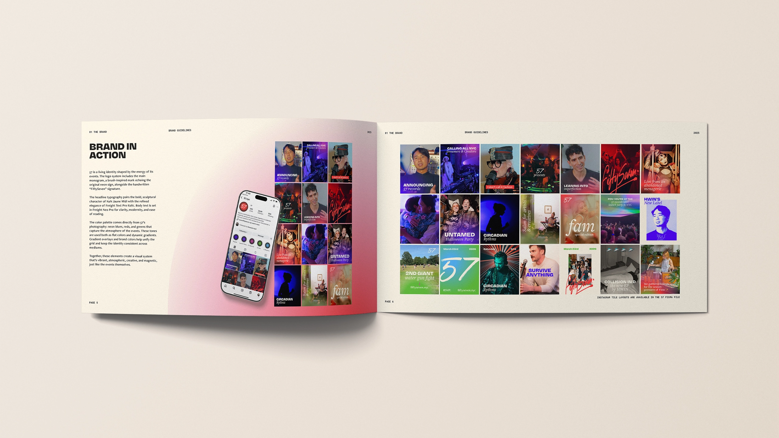
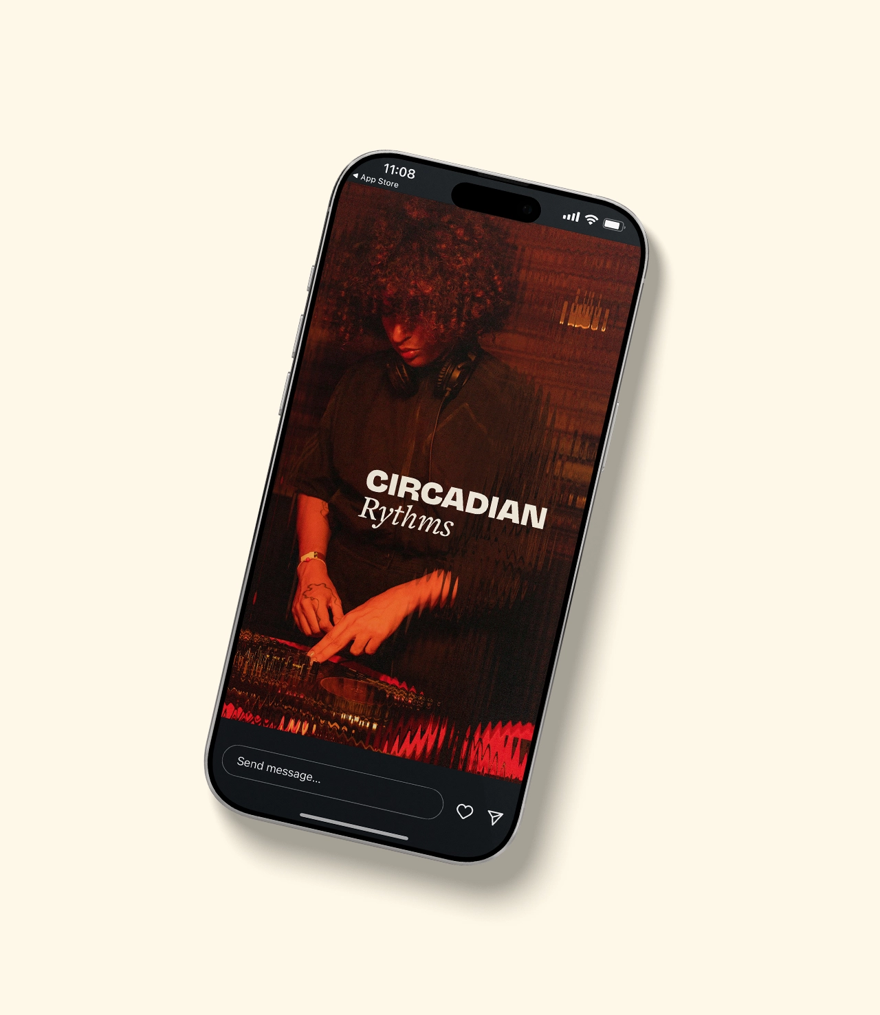
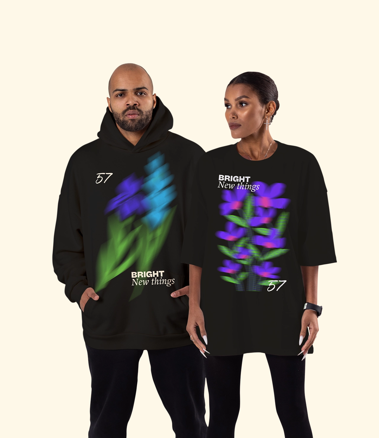
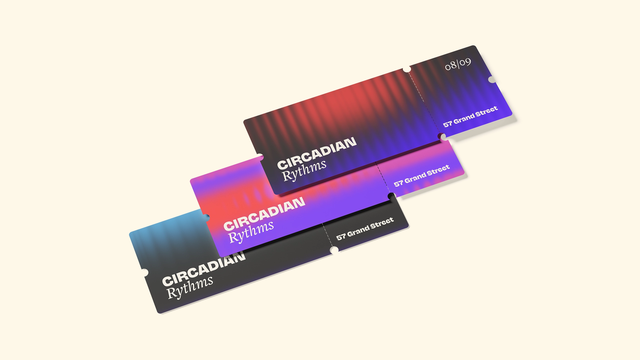
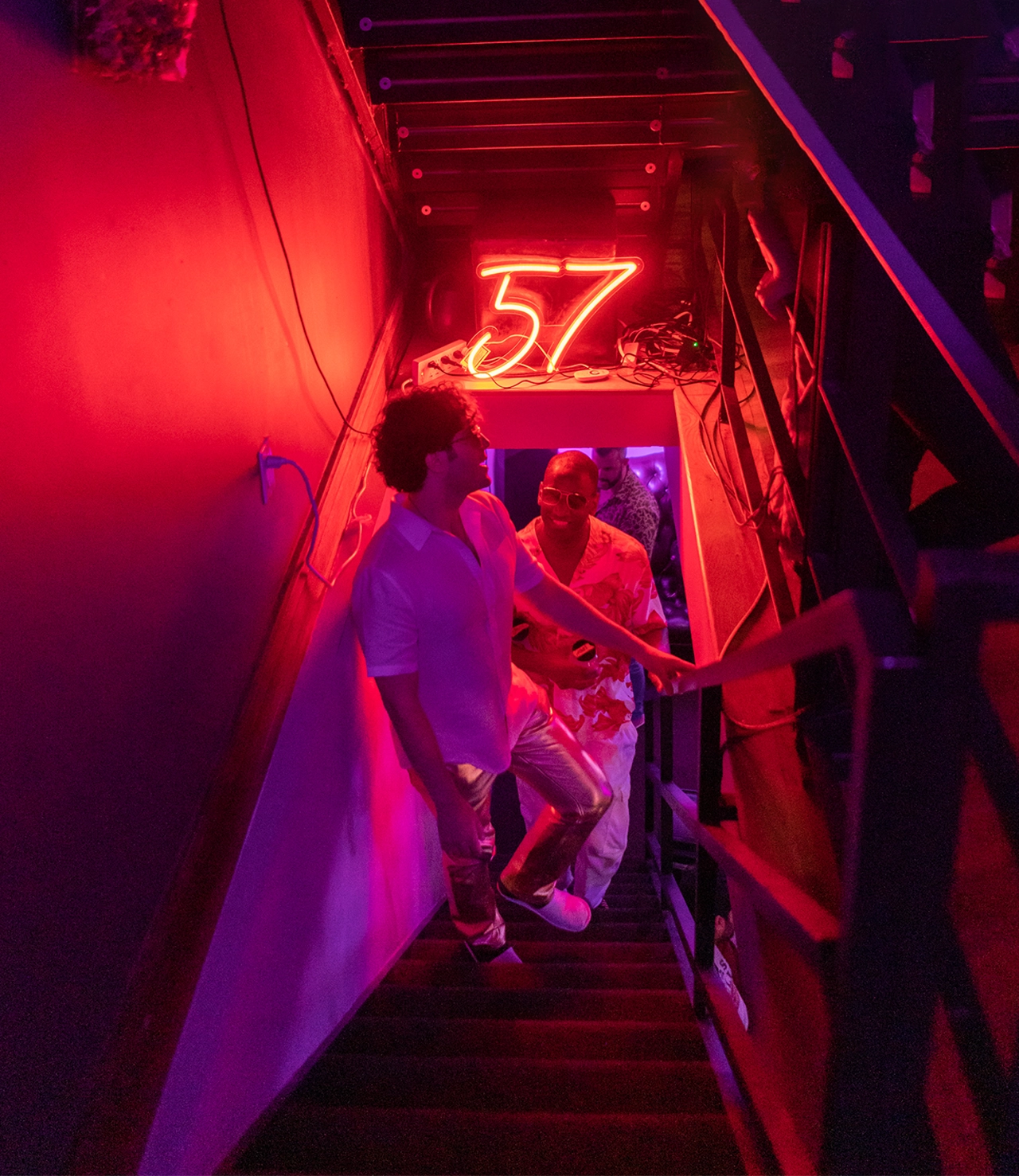
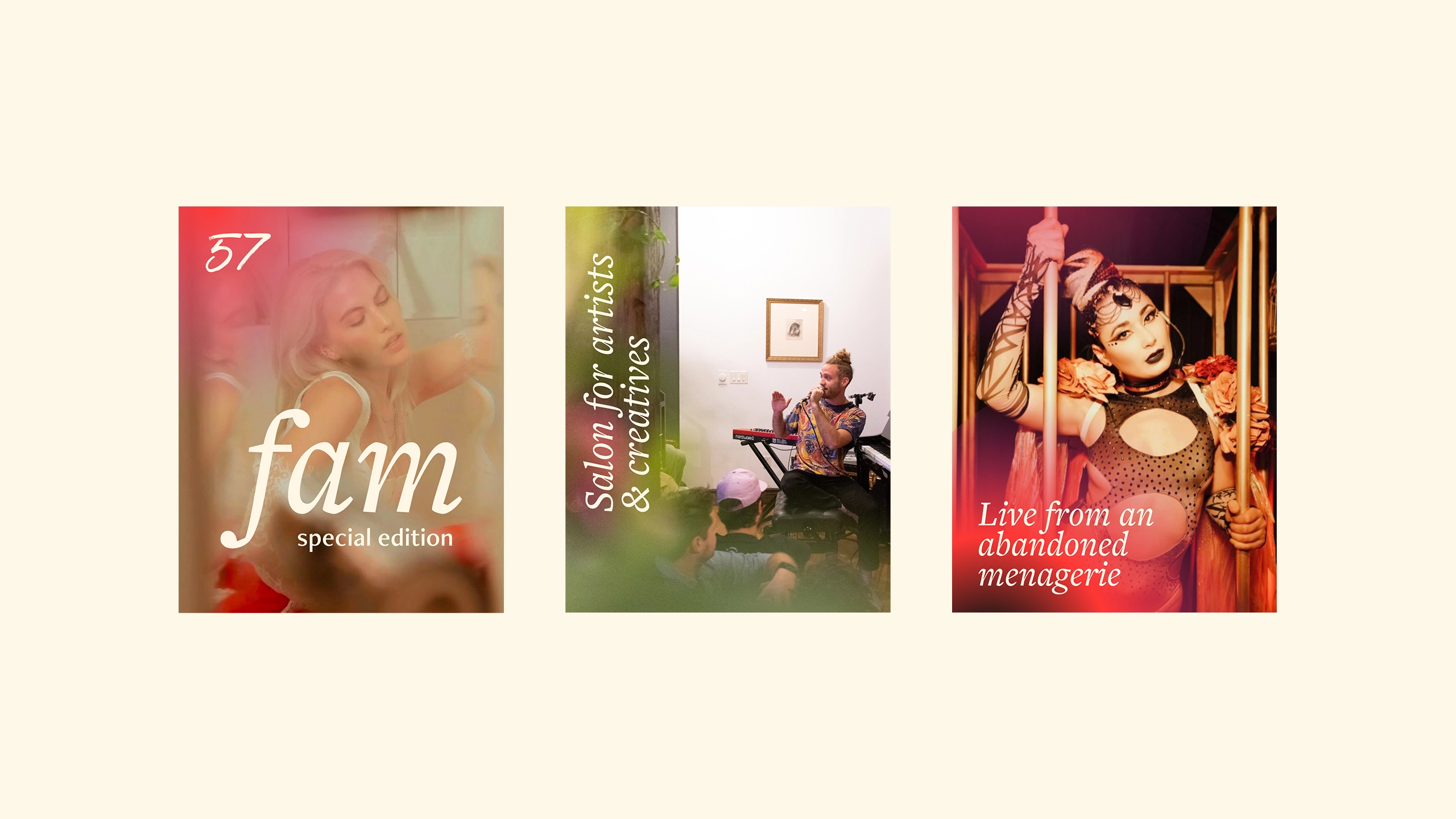
57 already had a strong cultural presence, but no clear system to hold everything together. The challenge was to translate its energy into a cohesive identity that could scale across events, platforms, and collaborations. I developed a full brand strategy and visual identity that captures what makes 57 magnetic: the balance between spontaneity and structure, intimacy and impact. Inspired by the atmosphere of the events, the identity draws from neon light, movement, and human connection. It creates a visual language that feels alive, expressive, and unmistakably theirs. The result is a flexible system that gives their team and collaborators clarity while leaving room for creativity. Every touchpoint now feels connected, from social media to merchandise to event experiences, strengthening recognition and allowing the brand to grow without losing its essence.
client
57.nyc
ART DIRECTION & GRAPHIC DESIGN
Alina Holtmann
team
Tim Wood, Johnny Hwin, Diana Hawk, Gabrielle Beaumont
More info
deliverables
Brand strategy and positioning, messaging and tone of voice, visual identity system, logo system (primary monogram and handwritten wordmark with usage guidelines), colour palette and gradient system, typography system (headline, subheading, and body hierarchy), imagery direction and treatment (including gradient overlays and visual effects), layout and composition principles, social media system (including Instagram grid structure), poster and campaign system, merchandise and event applications, digital and print assets, brand guidelines document