Home/Abroad
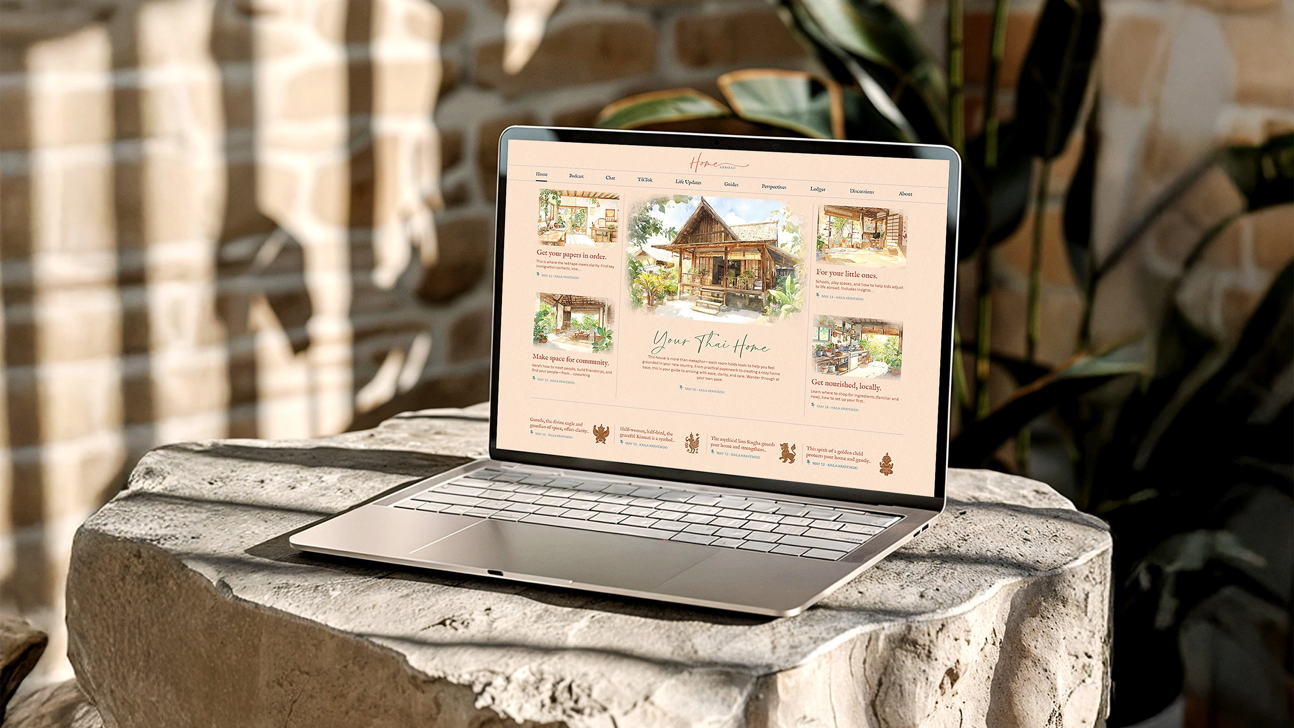
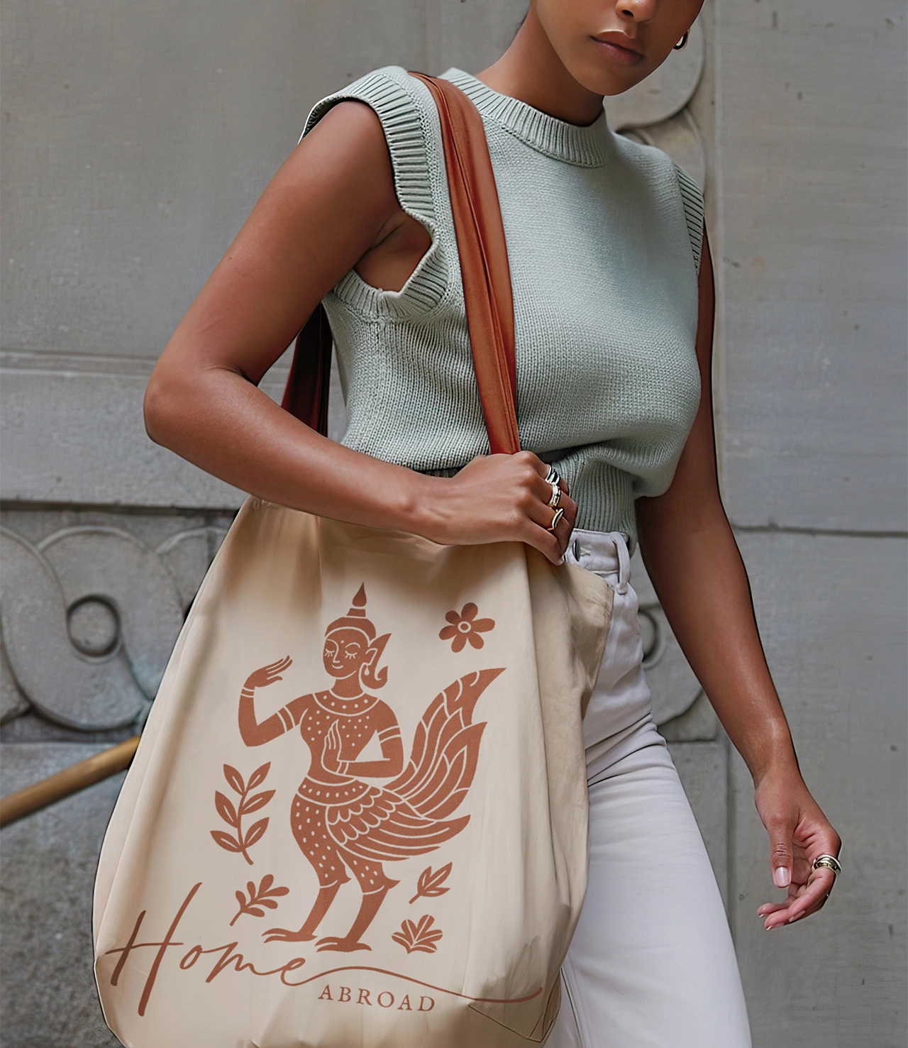
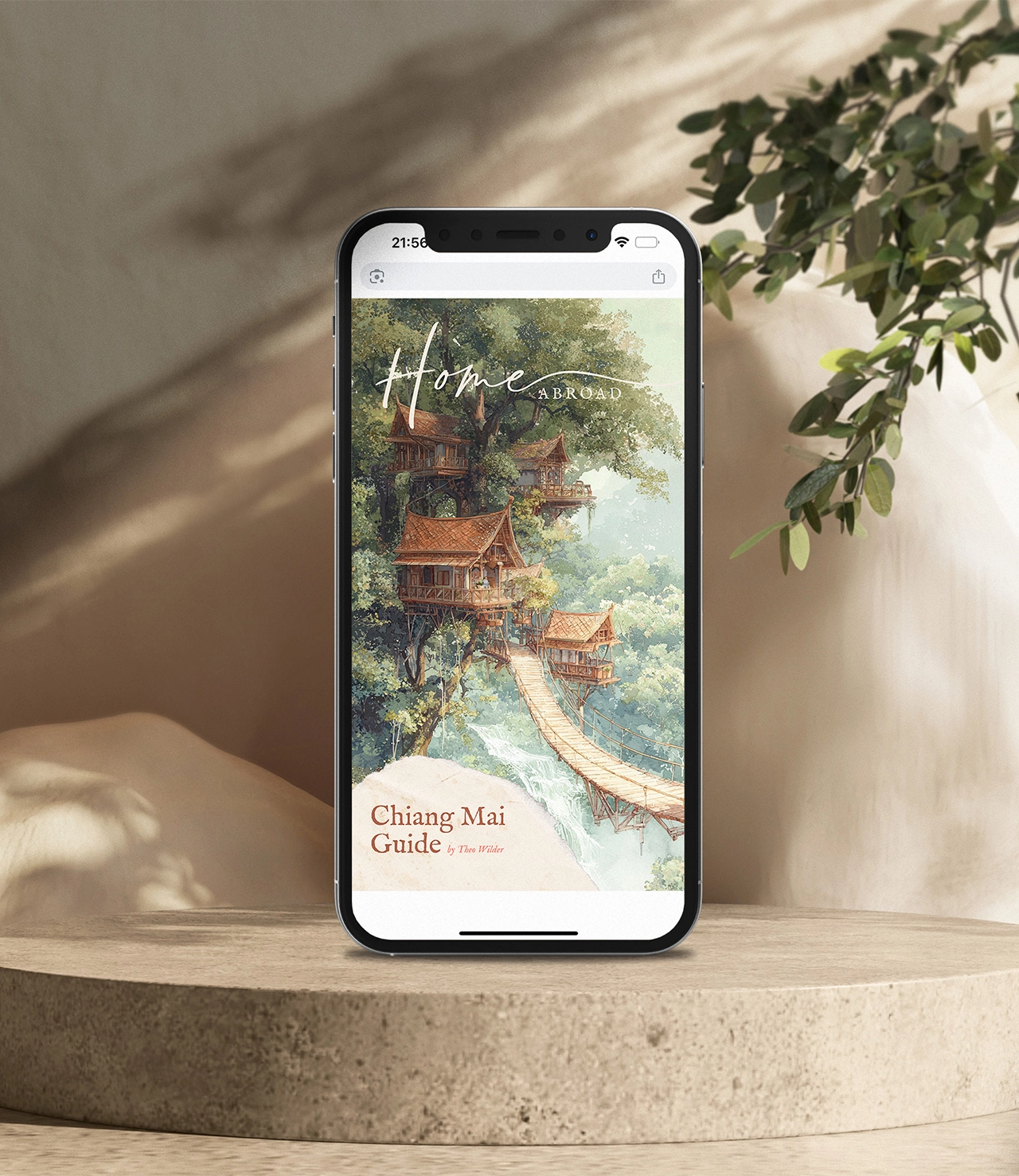
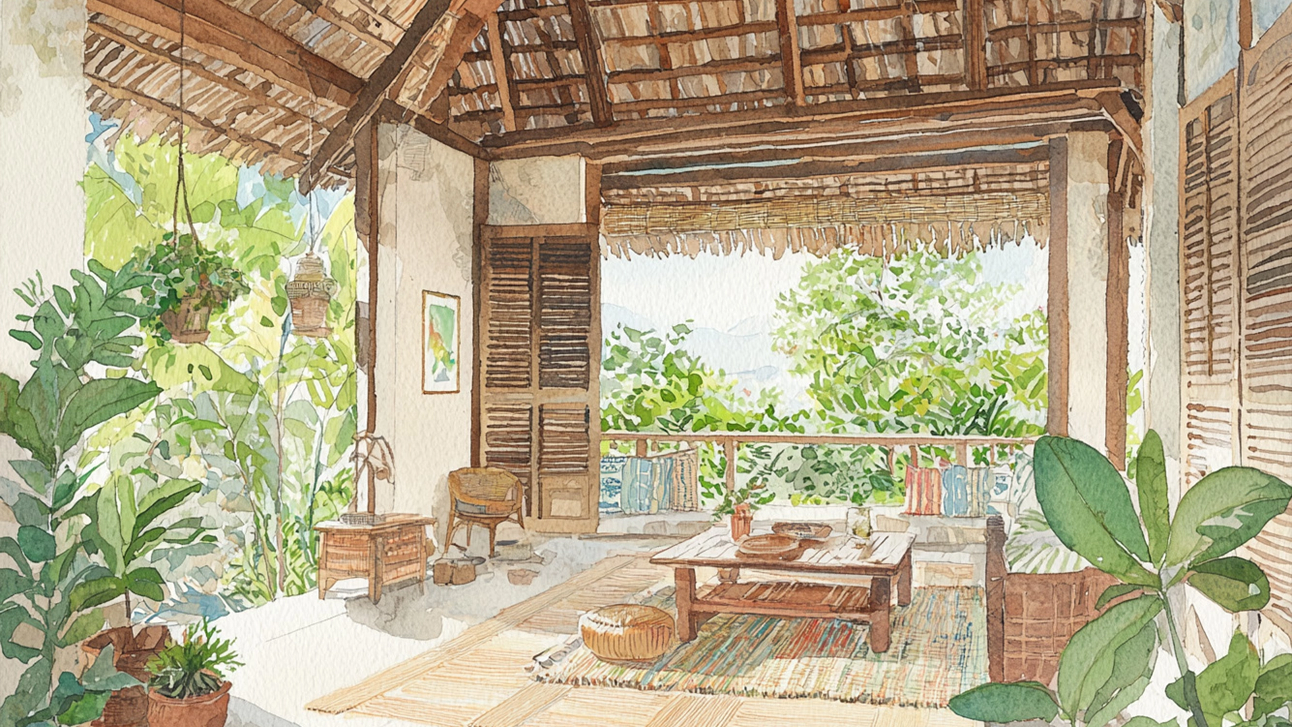
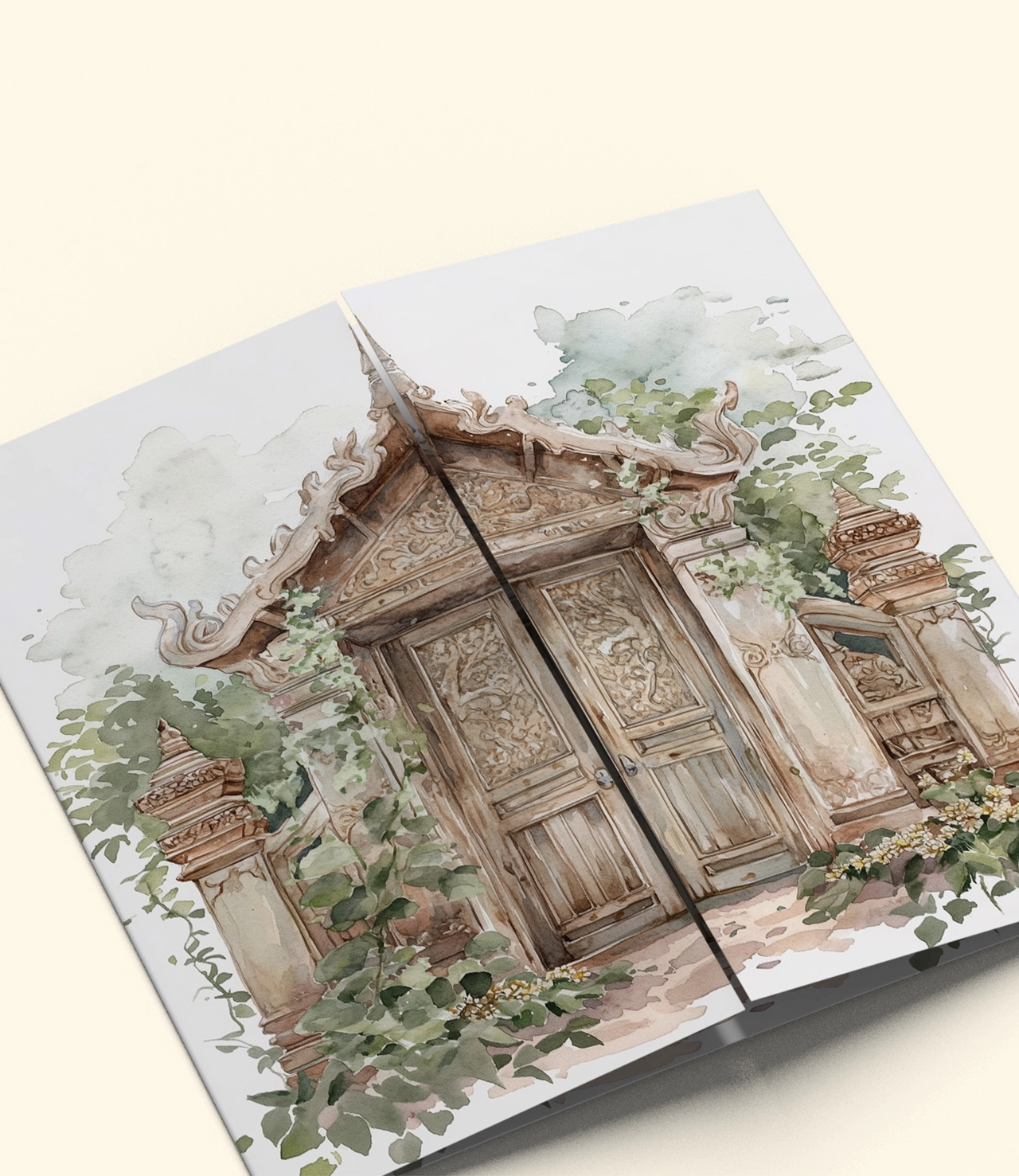
Home/Abroad had a powerful vision but needed a visual identity that could hold both its emotional depth and practical clarity. I developed a brand strategy and visual identity that reflects the feeling of building a life across borders. The system balances warmth and structure, combining soft, handcrafted elements with clear, readable design. Inspired by travel journals, architecture, and storytelling, the identity creates a world that feels grounded, personal, and expansive at the same time. The result is a flexible brand that supports both content and community. It allows the team to communicate clearly while creating a strong emotional connection, turning information into something people actually want to engage with.
client
Kaila Krayewski
ART DIRECTION & GRAPHIC DESIGN
Alina Holtmann
More info
deliverables
Brand strategy and positioning, messaging and tone of voice, visual identity system, logo system (wordmark, symbol, and extensions), colour palette and tonal system, typography system (headline, subheading, and body hierarchy), illustration style and art direction (watercolor and architectural sketches), textures and background system, iconography and mythical creature series, photography direction, layout and composition principles, digital platform design (Substack and web), social media and content system, print and digital assets, brand guidelines document